It has been a long time since I changed the look and feel of my blog website. I wanted to update it for a very long time, but couldn’t find the right time to do the overhaul due to day-job and other activities. I didn’t want to rush the idea of just updating the look, I wanted to make sure that it followed new trends, and has new features.
Whereas taking out and/or fixing some old stuff is also taken care of, gives better user experience, and maybe I should be able to monetize it a bit as well. Also, I wanted to give website security a top priority. I have been working on this for two weeks or so, and after careful planning and development, today, I finally launched the new version of my blog website, hope you like it!
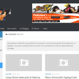
It features two content-sidebars now instead of one; left and right, with main content in the middle. Also, the content now shows a two-articles per row, with teaser text. My twitter feed account has been fixed. Since, I follow MotoGP sport, I’ve created a new poll relating to that championship. The two sidebars gives me enough room to place some advertisements, and link to my other websites of mine. The Logo update is still on the way, I should be replacing it very soon.
Most important feature of this new layout is that it’s 100% responsive, and mobile friendly. It works really well with IPAD and smaller screens. All in all, it has improved navigation. You can follow website in my network, and browse useful links mentioned in sidebars. Also, footer navigation now has links to my other websites; DVD Planet Store Pakistan, Speed Attackers – The Counter Strike Clan, and the Duel Masters blog site.
I hope the new design will engage visitors even more. Thanks.
